Flip & Find Product Label
Product Design, Fall 2025
Created in collaboration with Renee Zhu (RISD) and Ally Lee (Tufts) at the London College of Communication. In our User Experience Design class, we studied people’s everyday interactions with products and services. We analyzed their behaviors and ran tests to determine how environmental and technical circumstances affected experiences and outcomes.
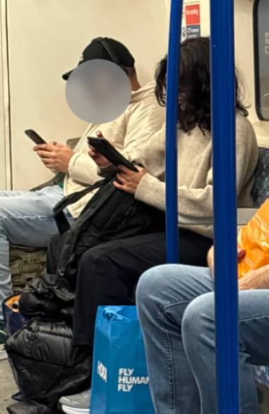
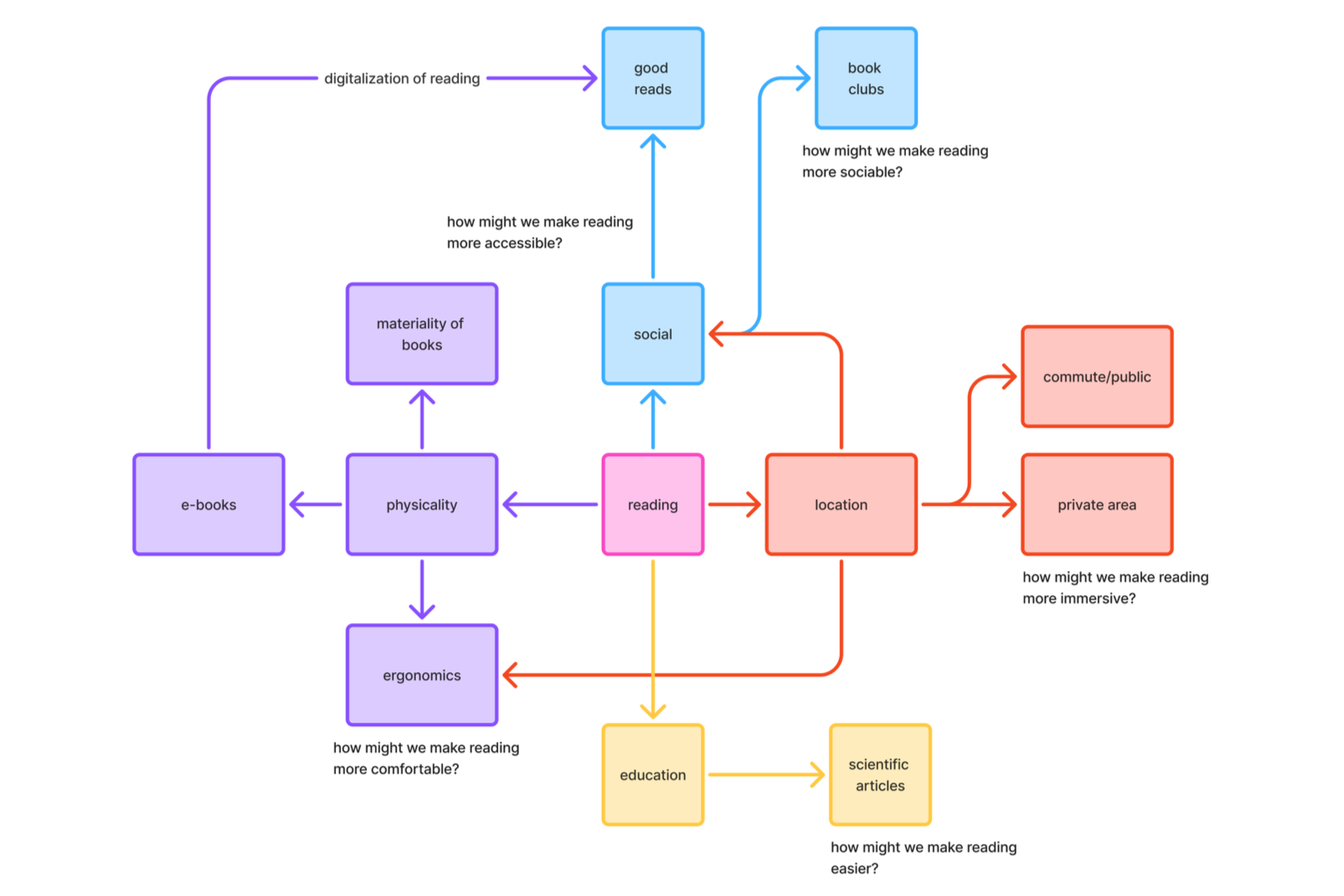
We noticed frictions occurring when people read in public, whether it was maps on the Tube or product labels at a grocery store. This raised a question from which our project was born: How can we make reading more accessible?
Initial Research
We examined the reading behaviors of both others and ourselves in grocery stores and on public transit. The frictions we noticed:
Text is too small
Packaging and products have too much information
Being in a hurry
We then surveyed over twenty-five people in North America and Europe, ages ranging from teenager to senior.
“The text is too small.”
“Information is badly organized.”
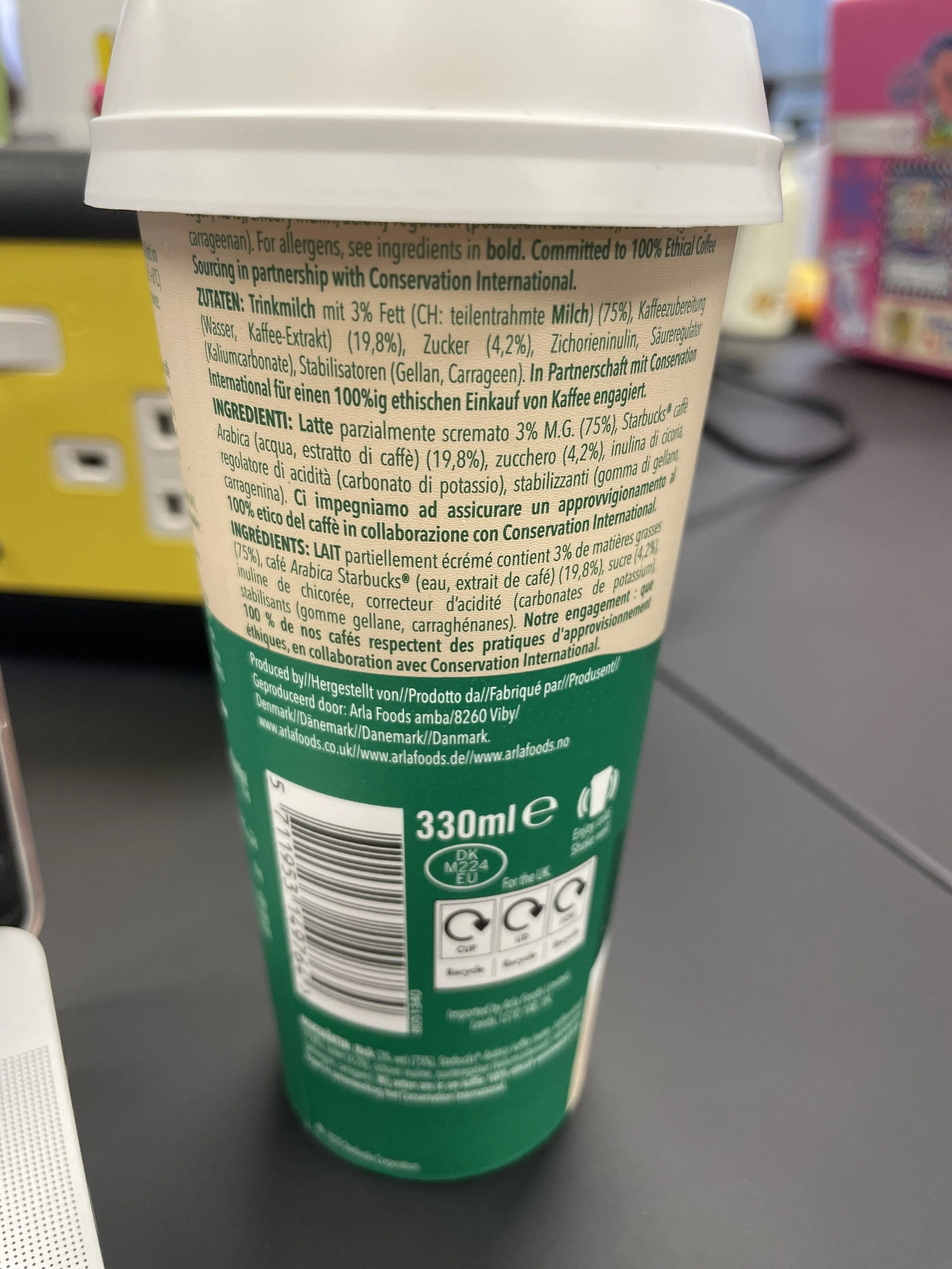
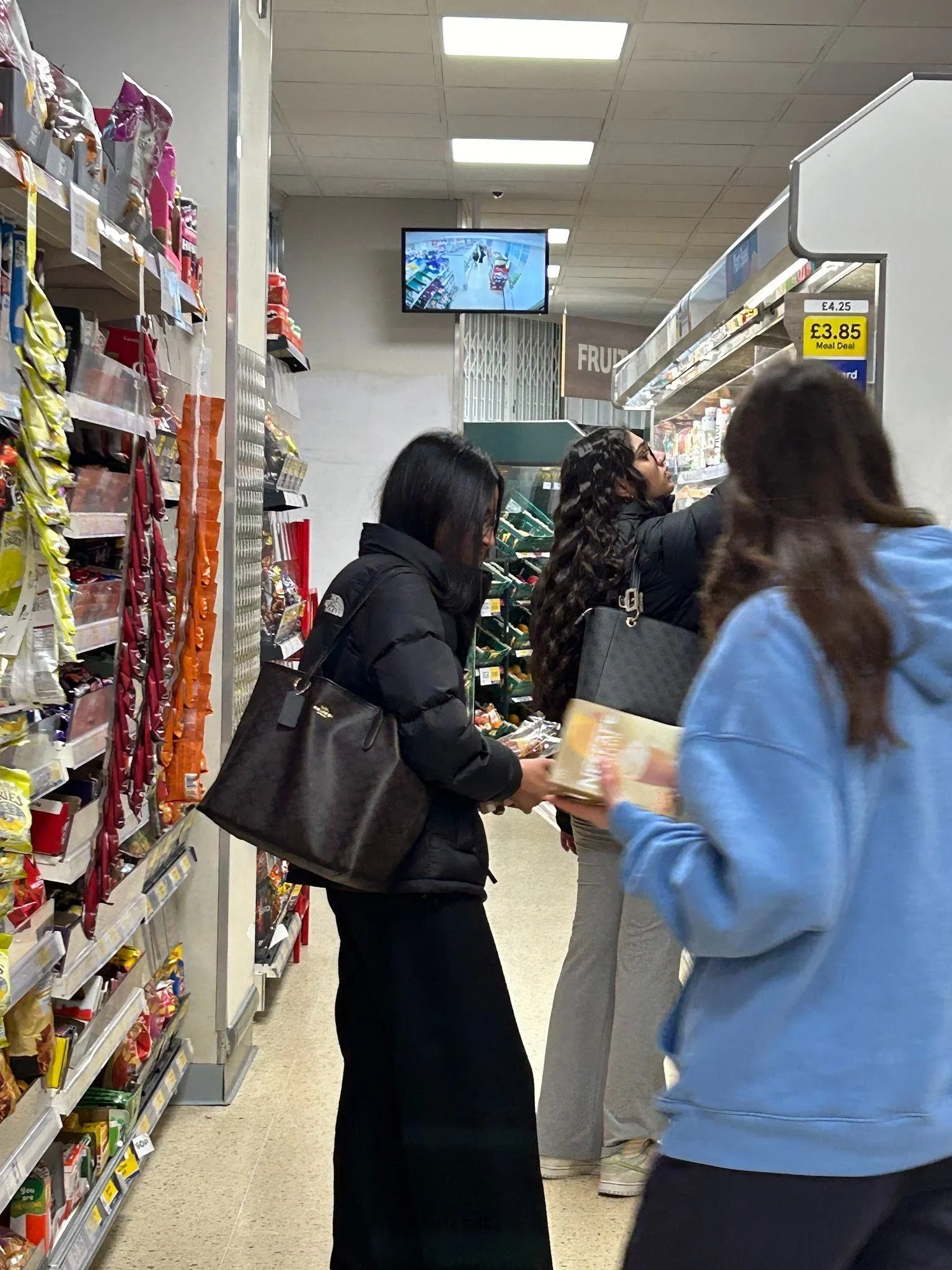
We also conducted various readability tests, one of which was asking our classmates to find the percentage of sugar and manufacturer of a prepackaged Starbucks drink.
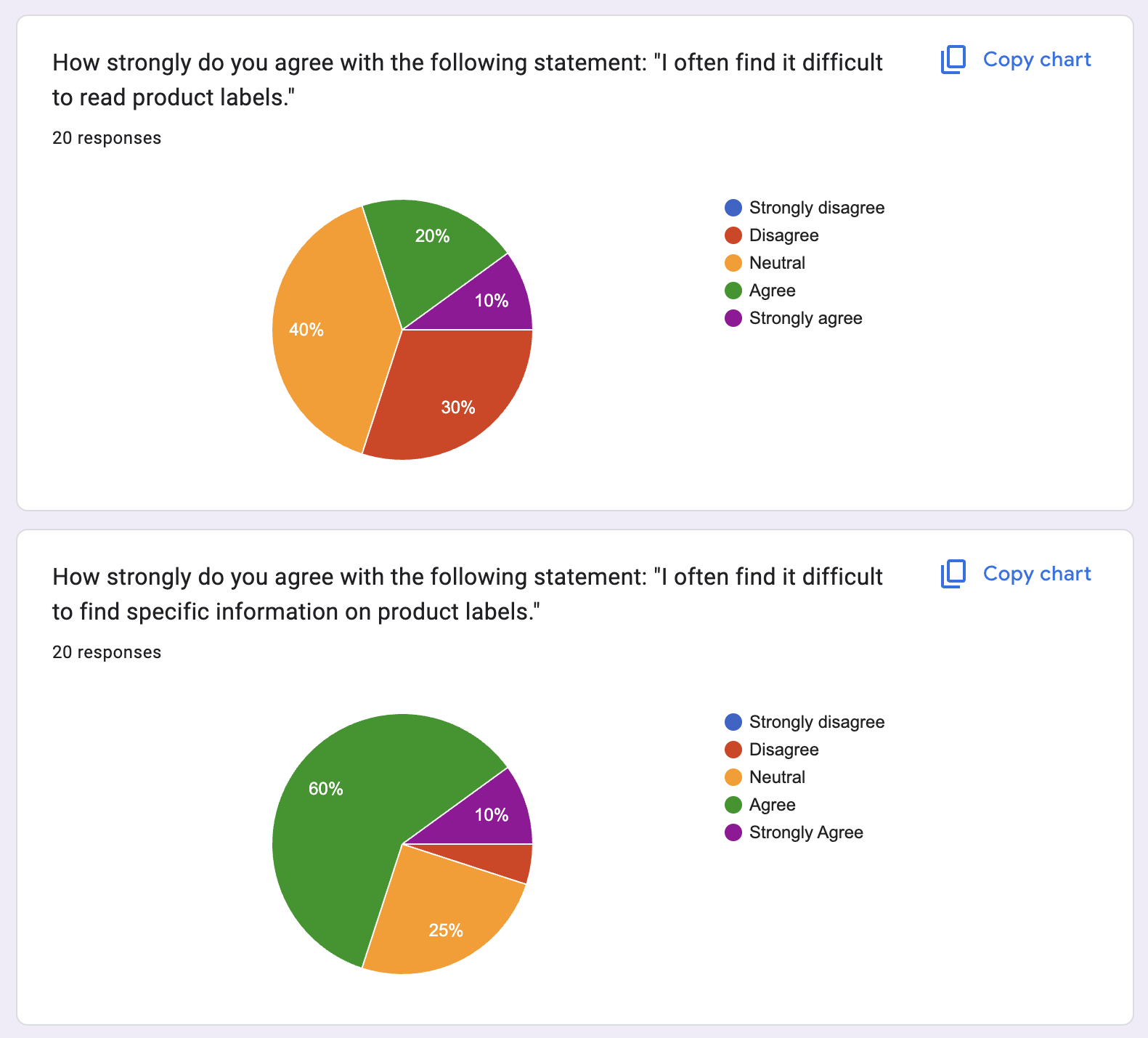
“The same information repeated in different languages is confusing.”
“There’s too much text and it’s too small.”
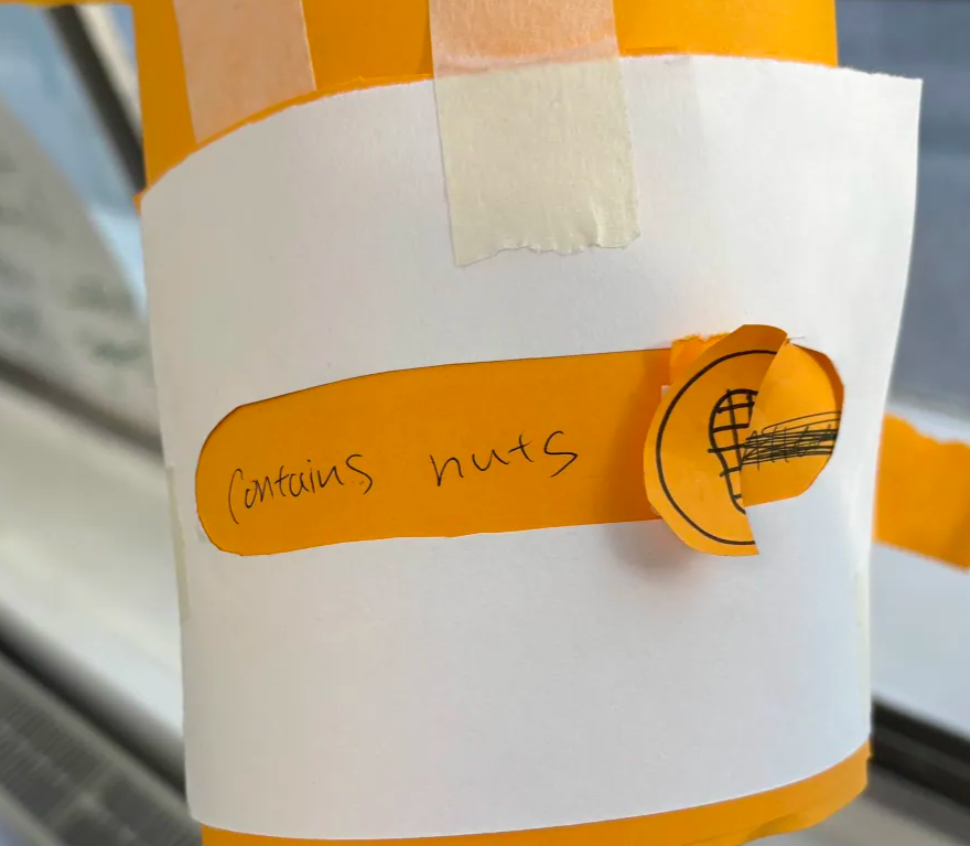
Initial Designs
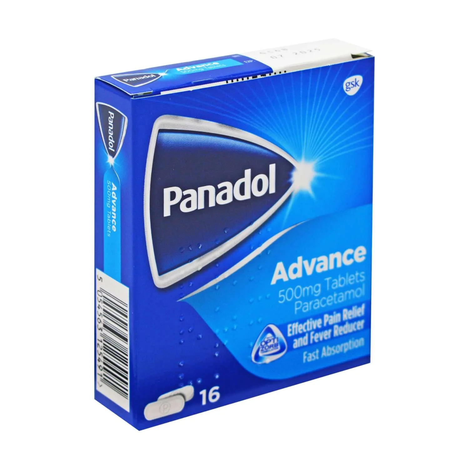
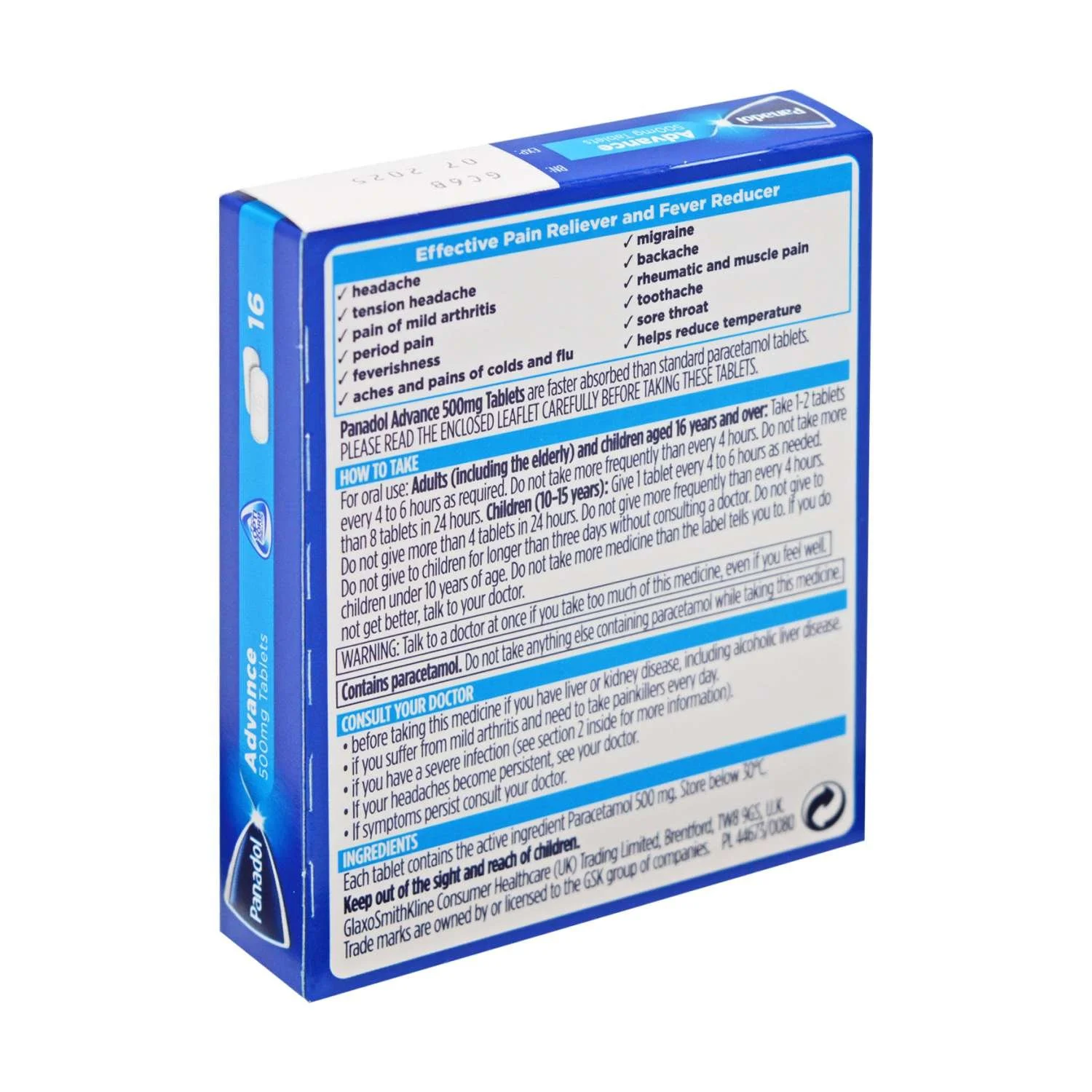
We decided to focus on medication labels because of their importance in people’s lives and their vital need for clarity. We then created paper prototypes of designs and conducted user tests with our classmates.
Design Direction
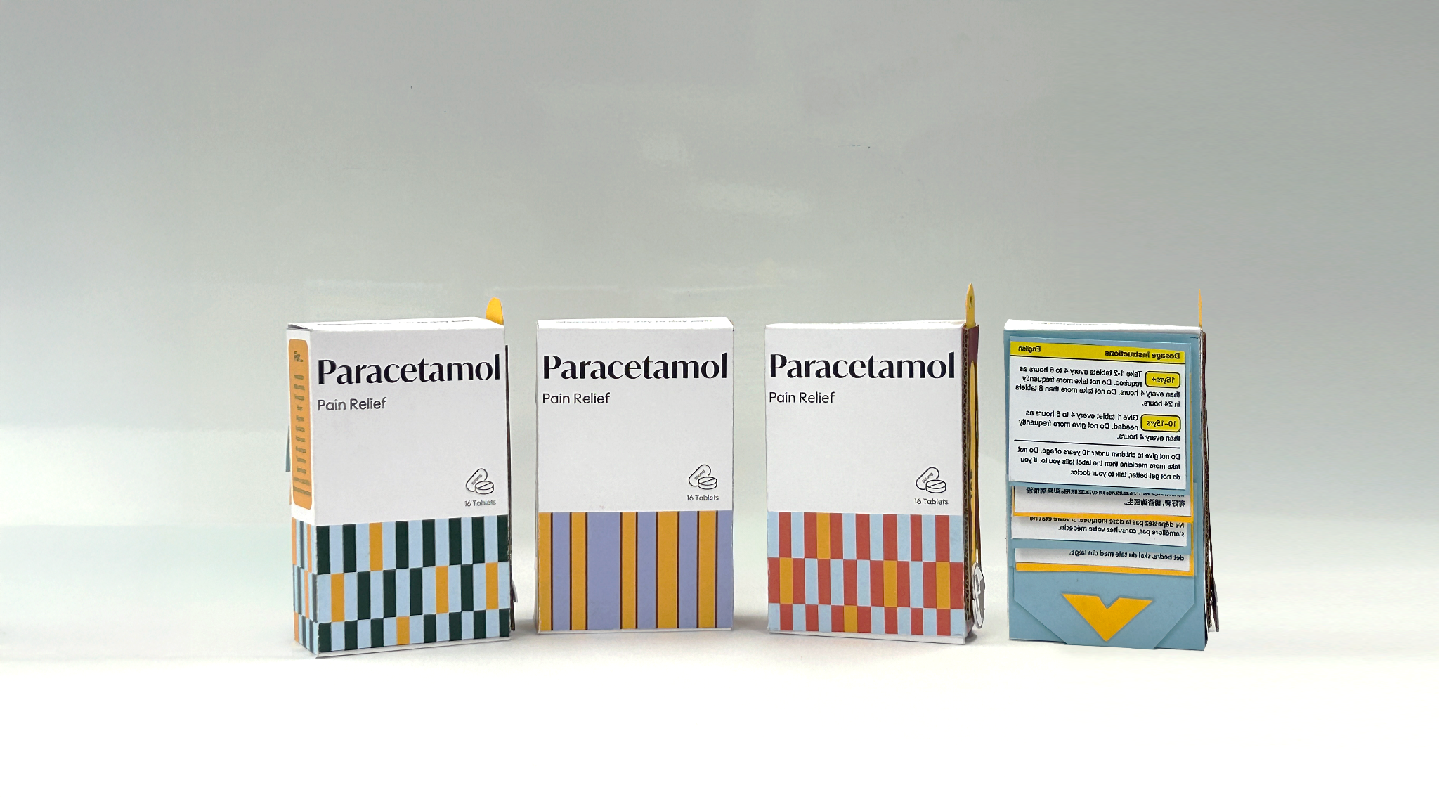
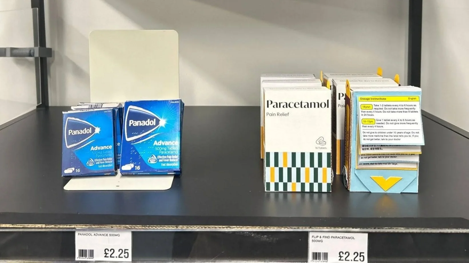
From the tests, we concluded that the user interaction of someone reading a medication label could be made playful to encourage further engagement. We selected a paracetamol package to redesign to be functionally informational and multilingual.
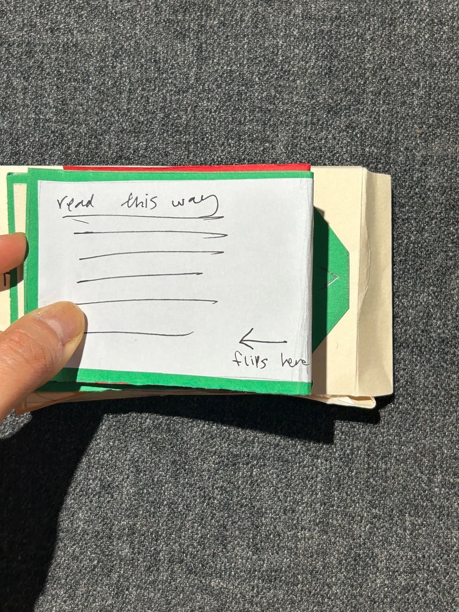
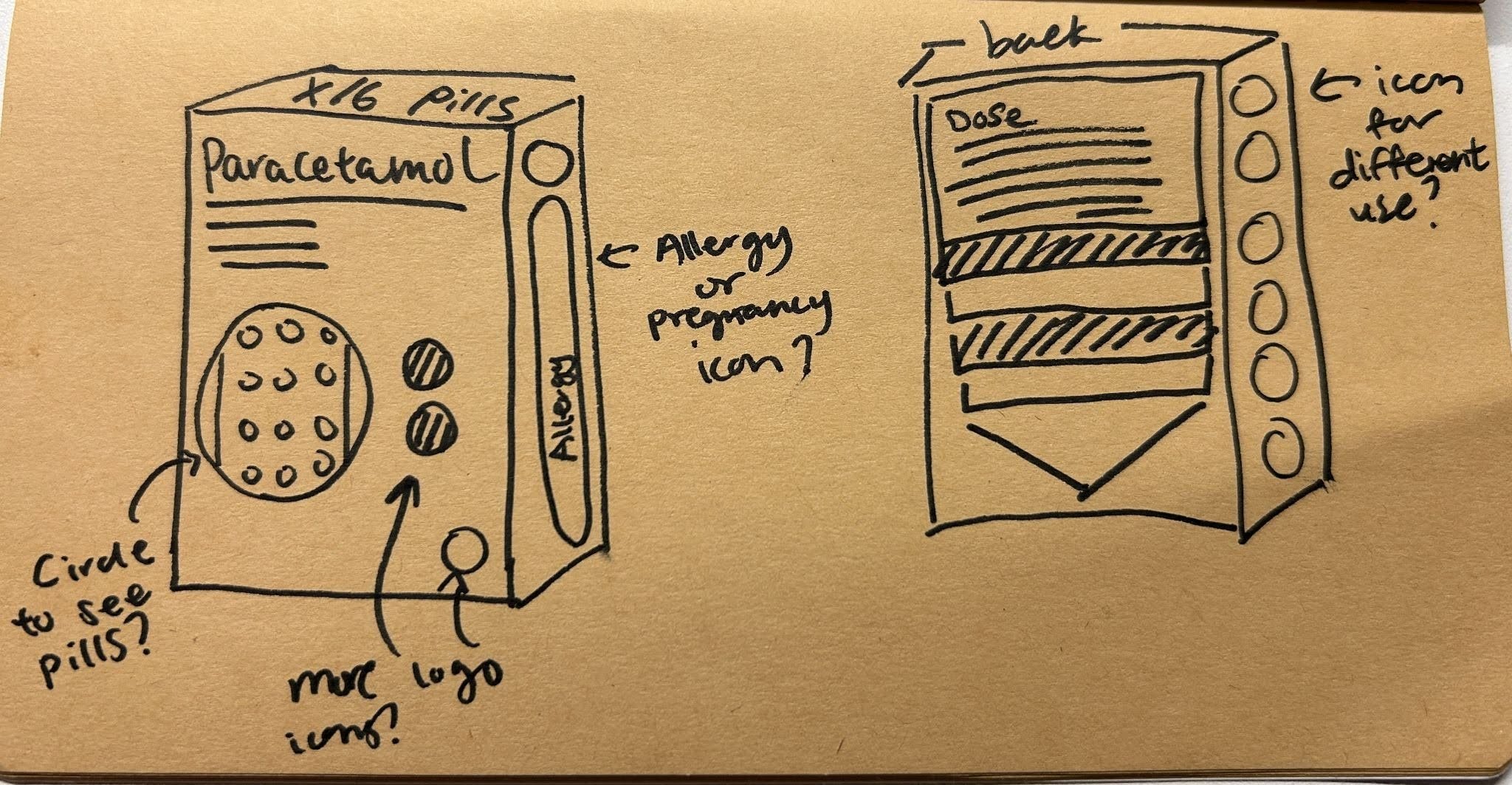
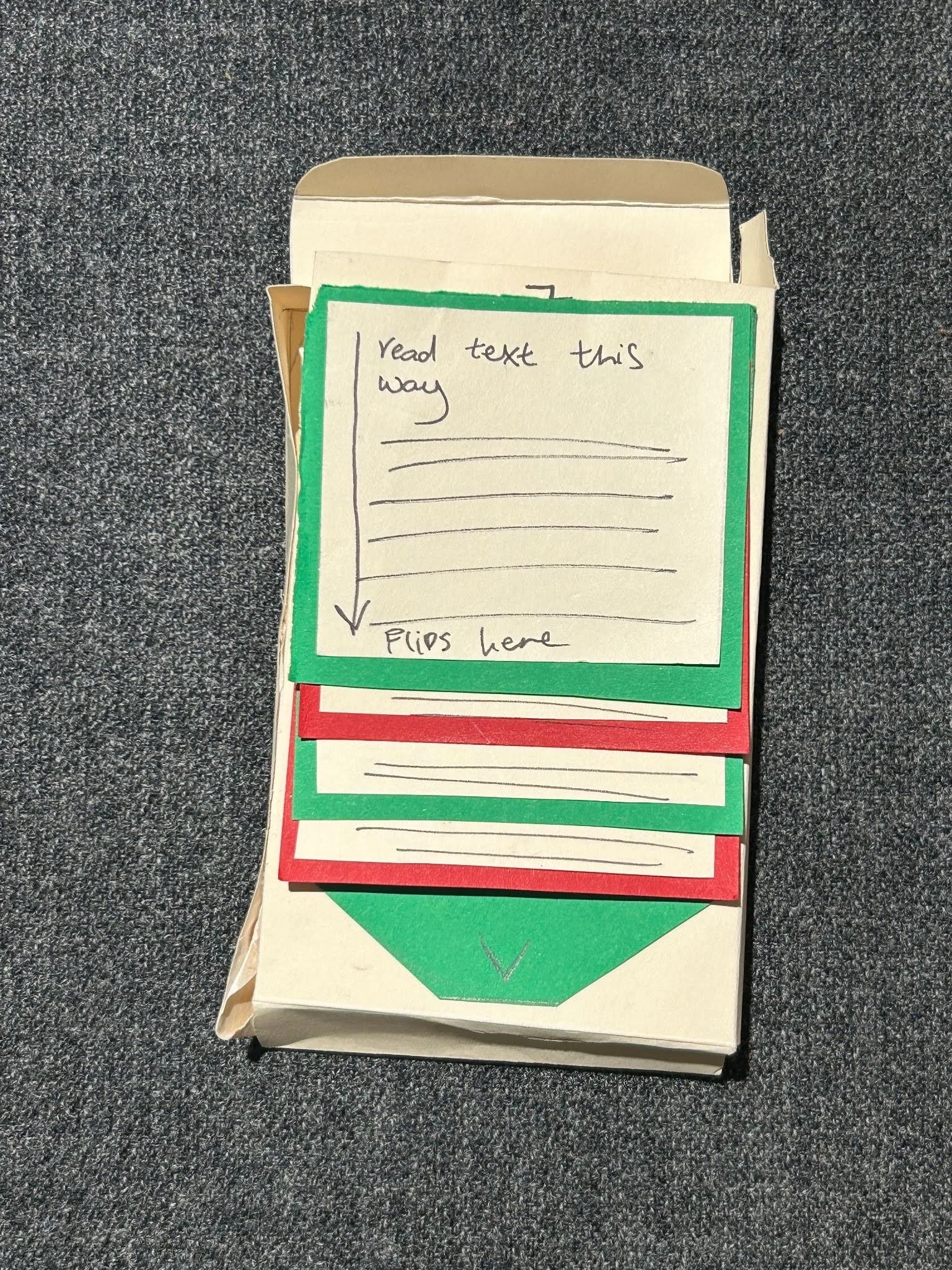
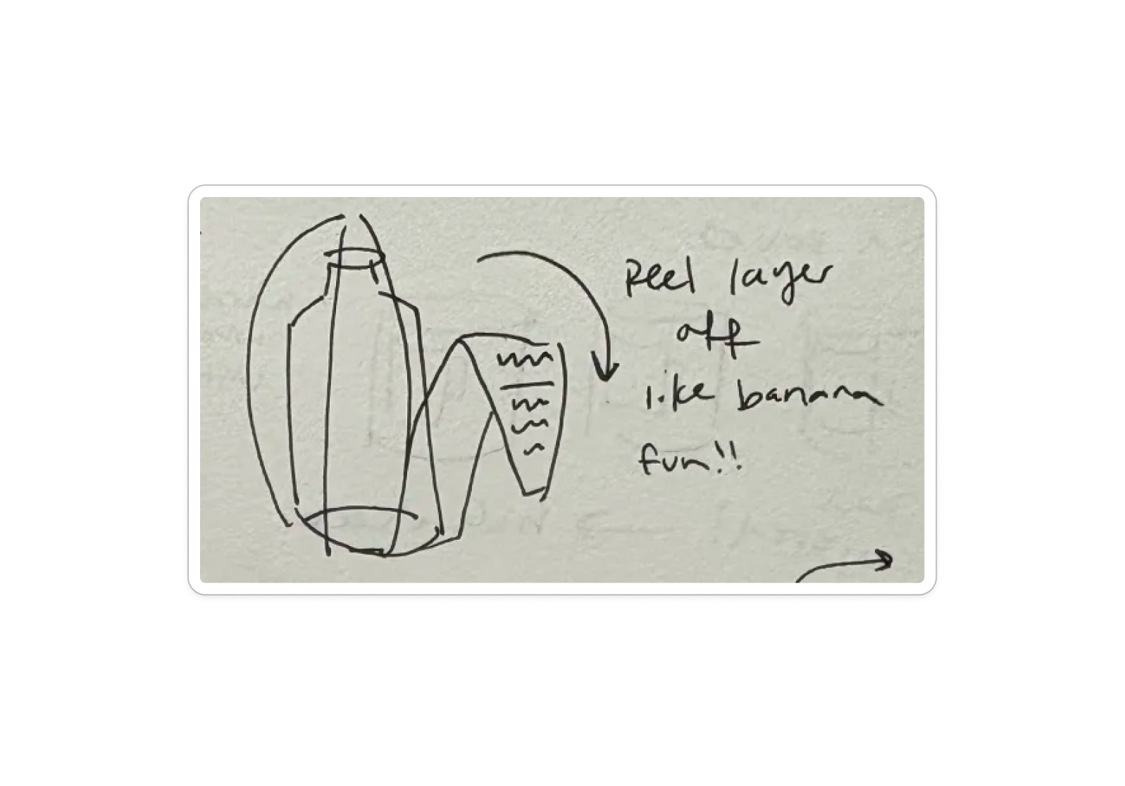
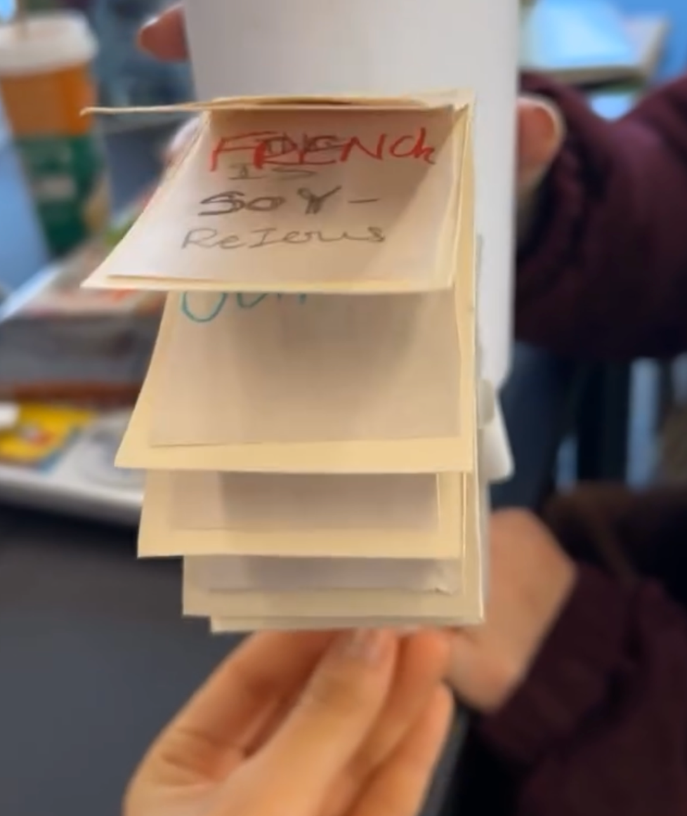
Flip and Pull Tab Design
We choose an interactive paper design where the user pulls a tab to flip through information. Further user tests helped us refine typeface choices and other design elements.
Final Design
The Flip & Find features improved legibility and increased accessibility through a fun user interaction. Instructions in multiple languages are separated by tabs, text is larger, and information is organized in a more understandable way.